Synack Acropolis is a program that recognises the Synack Red Team (SRT) researchers for consistently exceptional work. The SRT comprises 1,500+ top security experts using patented technology to deliver best-in-class offensive security testing.
Synack Acropolis
— Synack Red Team Community Website
My role: Concept and design
Web developer: Orange Labs
The Synack Acropolis microsite is developed to feature the researchers who have earned distinguished recognition. This speaks to the trust we build with the SRT and showcases their accomplishments. Not only are researchers proud to be spotlighted, but also the customers can see who they are working with.
GOAL
Redesign the website with Synack’s new branding, refresh the content, and improve user experience.
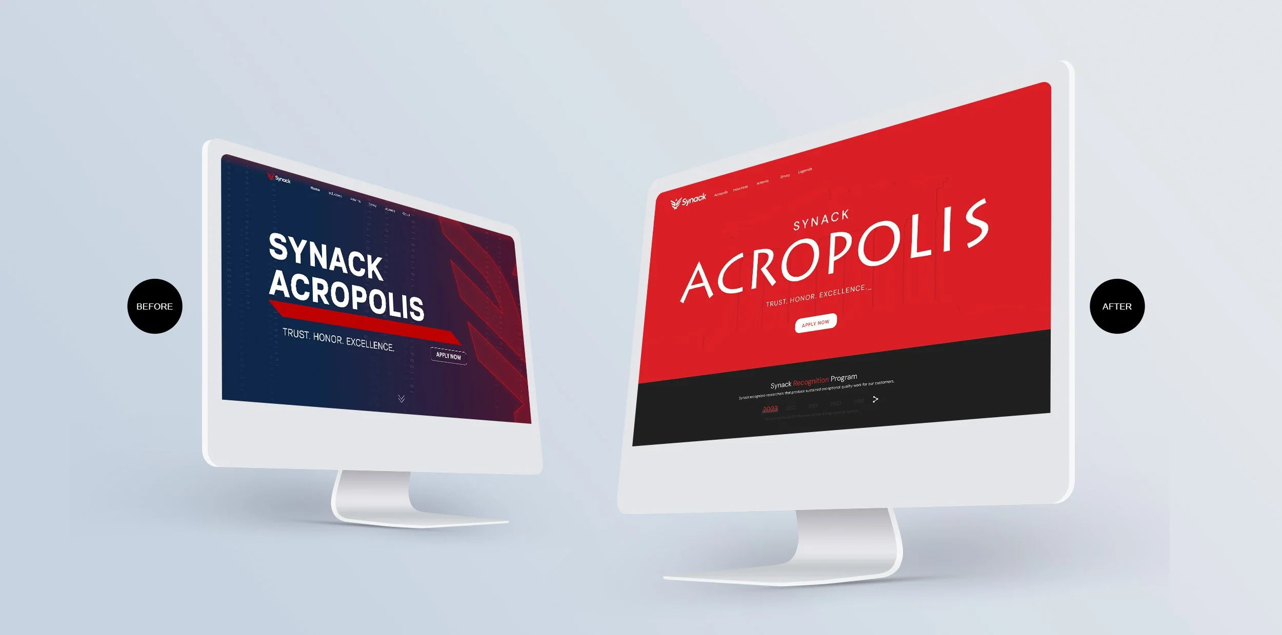
Website Before Redesign

PROBLEM
Old branding. The design didn’t change the corporate ID.
No description of what Synack Acropolis is.
All landing pages’ heroes were the same. Users could not determine which page they were on until they scrolled down.
Long descriptions of each category.
Deep pages with long scrolling.
Repetitive content.
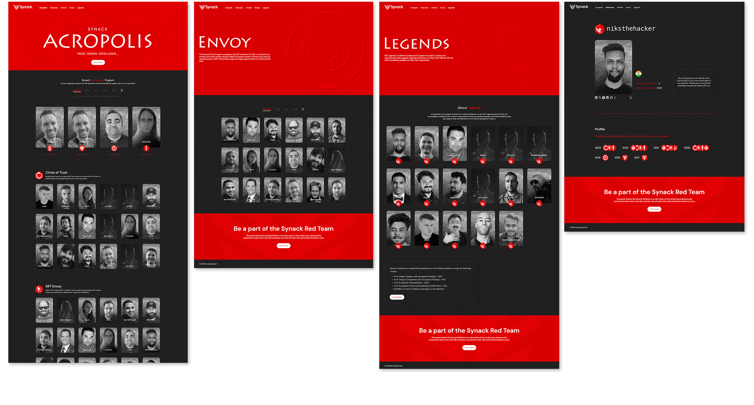
Redesigned Website
SOLUTION
The modern elegance of the new website aligns with Synack’s new brand identity.
The silhouette of the Parthenon and the font used in the top banners emphasize the metaphoric meaning of the program name.
Each page has a unique top banner with an icon recognized by the SRT members, which identifies the achievement level.
Each category's achievers were consolidated by year in descending order in the navigation to avoid scrolling.
The descriptions of each program level are clear and concise and are now “above the fold”.
For a uniform and sophisticated look, I made all portraits grayscale. I’ve decided to apply a soft background to photographs to give the researchers a more natural look in contrast to a stereotypical image of hackers in black hoodies on a black background.
Visit the website to see all the pages, watch animations, and experience interactivity.